By D. Dominick Lombardi
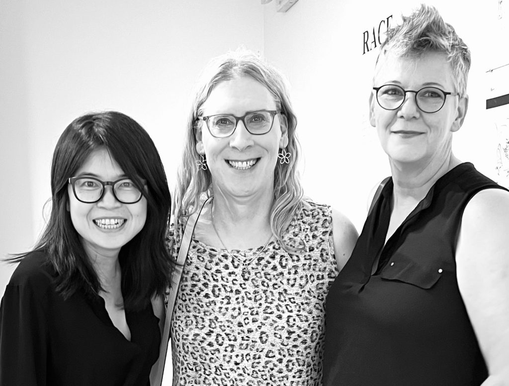
Nunu Hung, Char Schwall and Jill Downen, Photo credit: Catherine O’Donnell
I first met Jill Downen at a dinner party commemorating their solo exhibition “Weightless,” at NuNu Fine Art on Broome Street in New York City. I had the good fortune of sitting next to Downen’s life partner, the visual artist, author and educator Char Schwall, where I learned quite a bit about their complete and accomplished lives and histories. Downen, a recipient of several honors including a John Simon Guggenheim Memorial Foundation Fellowship and a Cité International des Arts Residency in Paris, continually expands the concept of drawing utilizing four basic elements and colors: plaster (white), gold leaf (gold), concrete (gray) and lapis lazuli (blue). The combination of two conventional materials, plaster and concrete, with two precious ones, goldleaf and lapis lazuli, might seem strange at first, until Downen’s personal history comes to light.
Growing up in a family of creative craftspeople, Downen learned early on about the use and importance of many architectural and decorative materials largely under the watchful eye of a master craftsman father and a musical mother. An environment where learning how to see was paramount, and how artful architecture was a complementary counterpart to one’s own body. As a follow-up to our first meeting and ensuing recent conversation, this is a third opportunity with Downen for INES magazine to delve deeper into what makes this artist tick.
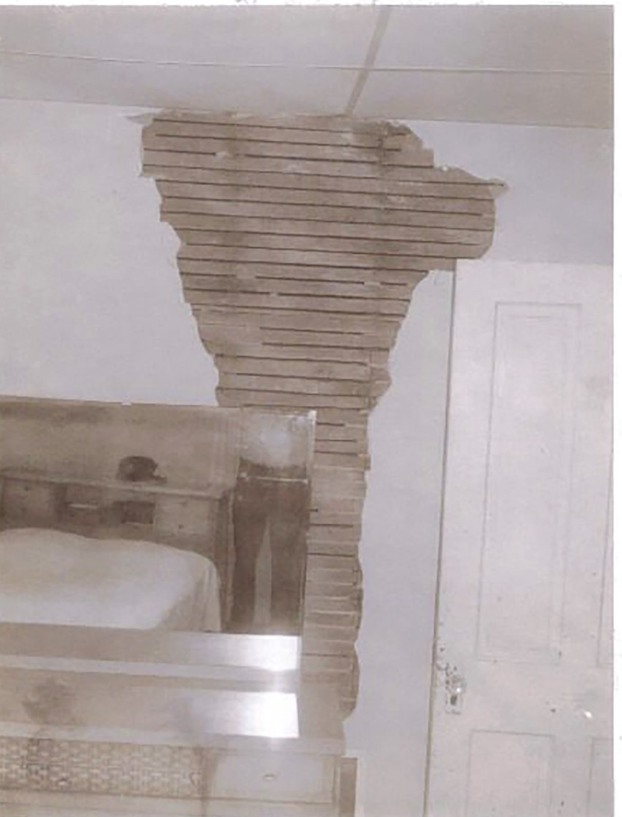
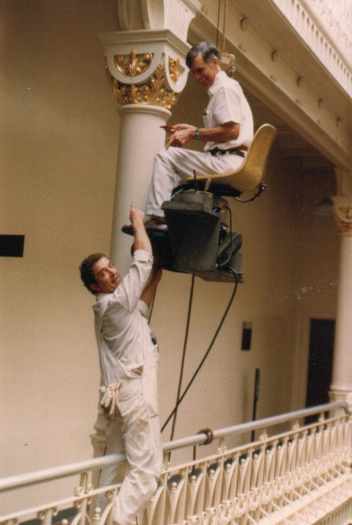
Lightning strike damage to the Downen family home, 1974. Photo credit: Wayland Downen
D. Dominick Lombardi: I thoroughly enjoyed our last conversation, hearing more about your past experiences and how they continue to inspire your creativity in a number of intriguing ways. Perhaps, first, just to avoid any confusion, it would be good if you can clarify how you see your work as drawings instead of reliefs or wall sculptures.
Jill Downen: Drawing is the first form of expressivity, before verbal acquisition, to reach out and touch a surface in a way that leaves a mark. Drawing is the main artery that runs through my life’s work – the immediacy of thought – to make sensations and ideas visible. Drawing with plaster and concrete fits my sensibilities and physicality. After years of drawing with plaster on various grounds, including paper, I arrived at the conclusion that the plaster needed an architectural substrate. Wood lath brings the skeletal support and conceptual framework in a unified form. Similarly, steel mesh used for exterior stucco provides strength in the concrete drawings. These materials allow me to erase with chisels and grinders, building up the surface and then taking it back down to the bones cyclically until the piece is resolved.
Other bodies of my work could be categorized as reliefs and wall sculpture, yet the exhibition at Nunu Fine Art is clearly drawing by my definition. They are the result of years of accumulated mark making, erasing (subtraction), and articulating a space with light and shadow.
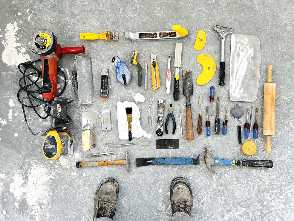
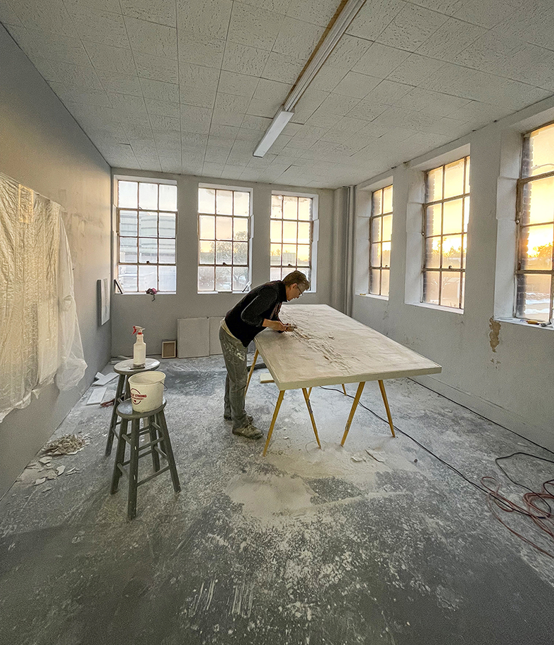
Jill Downen’s drawing tools on the studio floor, October 2024, Photo credit: Jill Downen.
DDL: I love “the immediacy of thought.” Drawing, or mark-making of any type, has such a direct and distinct connection to what is happening in an artist’s mind. How you employ that concept in your art is so uniquely impressive it takes time to appreciate fully.
At your talk at Nunu Fine Art, you mentioned the first time you saw wood lath behind plaster. This was when you were a child and your home was struck by lightning. Please share with us that story and how it has influenced your career to this day, adding more clarity to your process of working with challenging materials like plaster and concrete.
JD: Thank you for asking about this critical event in my childhood. During a severe storm, we were in the living room when a terrifying “zzzattckkk” sound boomed, and the television exploded before our eyes. The small Zenith screen shattered, spattering glass shards across the carpet, and we ran outside. We learned from the firefighters that lightning struck the roof and hit the TV. Antenna situated in the attic. It crackled its way through the flesh of the three-story building, blowing the skin off the walls as it bolted downward. Large scars were left in the plaster walls, exposing the wood ribs underneath. Looking back, the event hardwired in my body a deep consciousness of the symbiotic relationship between the human body and architecture. I would eventually come to recognize the conceptual and philosophical implications of my lived experience in the writings of Maurice Merleau-Ponty and Gaston Bachelard. Dad did all of the repairs himself. Watching him work with plaster and concrete demonstrated that labor is an act of love and architecture is an ever-evolving extension of ourselves. For me, plaster and concrete are like living materials. Mixing water with particulate materials sets up various stages of material transformation, each with endless potential. These materials are central in my drawings, installations, models, and sculptures. I find clarity and poetry in materials.
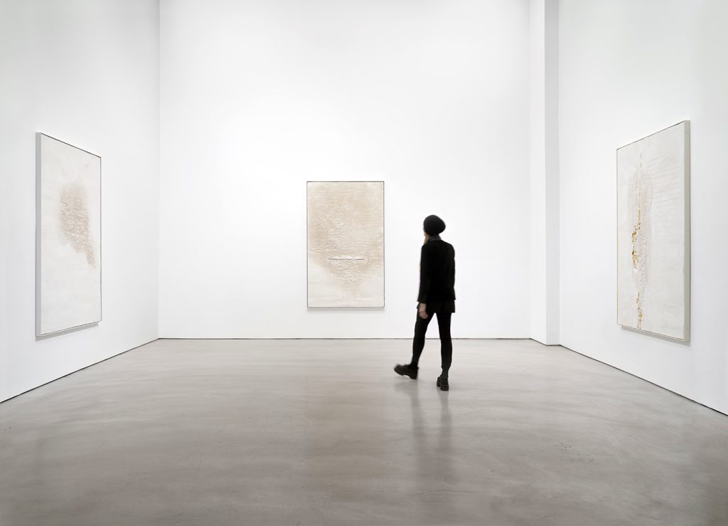
Jill Downen, installation detail of Weightless, Nunu Fine Art, NY. Photo courtesy of Nunu Fine Art
DDL: I remember reading in your essay about your process and how plaster and concrete warm as they dry due to the chemical reactions. Something I have experienced myself and can see how that ensuing heat can suggest a form of life in the materials. You also have a story around that same time when your father was working with gold leaf – that magical moment when you were assisting him.
JD: Material understanding comes with practice and great parents as my first teachers. Wayland Downen was the master sign painter for Anheuser-Busch Brewery in St. Louis. He lettered the Budweiser wagon and gilded the Corinthian columns in the Brew House. On weekends, he would make signs in our garage. My job was to sit on a wood crate next to him and catch “flags” or flecks of gold that floated through the air. As he would burnish the gold leaf, the magical flags would be as thick as a swarm of fireflies, and I’d catch them with a tin soup can. Gold connects me to Dad and divine transcendence.

Wayland Downen (with Dan Valeroy) gilding in the Brew House at Anheuser-Busch Brewery in St. Louis, 1980. Photographer unknown, Jill Downen gilding in their Kansas City studio, 2024. Photo credit: Char Schwall.
DDL: I can definitely picture those glistening gold flecks you were catching – add white rays of sun streaming through a window and it’s like a scene in a Spielberg movie. Familial influences are often among the most compelling stories, especially when it comes to the actual fabrication process.
So far, we have three of the four primary materials you use coming from experiences in your youth. Where and how does Lapis Lazuli come into the picture? It’s such a wild card. Is it related to your love of Giotto?
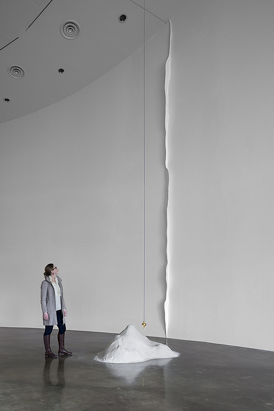
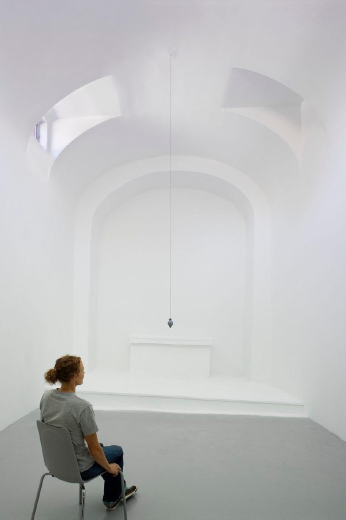
Left: Jill Downen, Alignment, 2014, American University, Washington, DC, plaster, polystyrene, plumb line & gold leafed plumb bob, dimensions vary, wall height 28 feet. Right: Jill Downen, Siamese Gates, 1989, oil on canvas, 48 x 60 inches. Photo credit: Char Schwall.
JD: My practice began with abstract painting and printmaking based on architectural floor plans. I approached the blank canvas with line work in French Ultramarine to reference blueprints. During college, I had a summer job with an architectural firm, and the Diazo blueprint machine, with its distinctive ammonia smell, was an influence. The analytical view of architecture in blue schematic plans (top view, end view, isometric view) balanced the sensorial connection I had with architecture. A plumb bob with a chalk line also became a drawing tool and sculptural element in my work. I went to Italy for the first time in 1997, and my mind exploded when I saw Giotto’s work face-to-face. I always loved Giotto, but it all clicked when I stood inside the Basilica di San Francesco in Assisi. If I could be a building, that may be the one. The unity of Giotto’s fresco cycles, depicting the life of St. Francis and Christ, within the architectural envelope, helped me see the synthesis of painting and architecture. The aged frescos, with their cracks and patched areas, resonated with my view of architecture as a second skin. Giotto’s rich blue pigment came from lapis lazuli. During the early Renaissance, lapis lazuli was more costly than gold. Research on lapis lazuli led me to the Badakhshan mines in Afghanistan. A gem and mineral dealer named Aisha Jan (Rocksaholics) selected specimens for my practice from those mines. I cut, polish, and inlay the stone in sculptures and drawings to speak about spatial orientation and a sense of true horizontal grounding. Blueprints, plumb lines, Giotto’s blue, and lapis lazuli all run through my life’s work.
DDL: It is remarkable how your process is so deeply rooted in personal, architectural, and art historical spheres. There is that visceral sense of a living history in the way you work your materials, adding abrasions and soft edges combined with more definitive marks and shapes that tug between the classic and the conceptual. Reflecting on your methods, as you mentioned in a recent conversation, I paraphrase that within the austere framework of your art, color becomes symbolic of the materiality. That color is conceptual as opposed to perceptual. Can you elaborate on that theory?
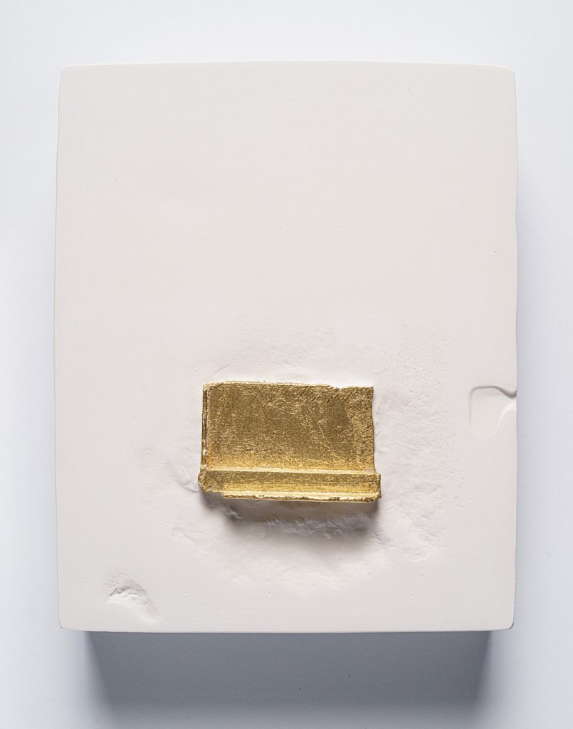
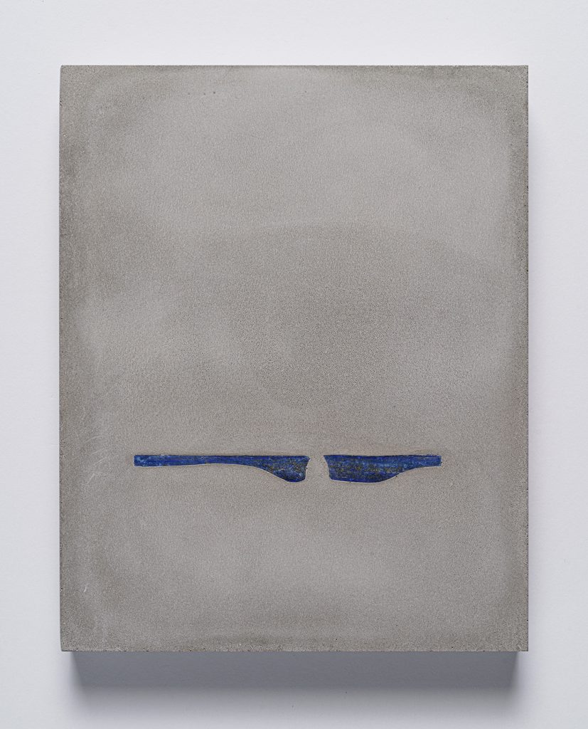
Left: Jill Downen, Missing Piece, 2024, plaster, gold leaf, 10 x 8 x 1 inch. Photo by E.G.Schempf, Photo courtesy of the Artist and Nunu Fine Art NY. Right Jill Downen, Unsettled 2, 2024, concrete, lapis lazuli, 10 x 8 x 1 inch. Photo by E.G.Schempf, Photo courtesy of the Artist and Nunu Fine Art NY
JD: Yes, in my work, I view color as conceptual in that it indicates symbolic meaning, particularly in terms of cultural context. The history of color symbolism first intrigued me when I read Kandinsky’s book On the Spiritual in Art. He argued that color and form held meaning beyond representation. In my research, I’ve learned that lapis lazuli is associated with the Hindu and Buddhist throat/thyroid Chakra, which is vital for opening energy flow related to the higher self, creativity, verbal communication, and quieting the mind.
I see gray as a conceptual color that functions as a place of betweenness, a space for reflection. The nuance of gray prevents the extremes of black and white thinking from spinning out of control. Gray negotiates dualities: of yin and yang, right and wrong, object and subject. In its range of tonality, grayness serves as a metaphor for ambiguity and states of becoming, which are vitally important when creating an artwork. The middle ground, hidden beneath absolutes, awaits opportunities to disrupt certainty, challenge assumptions, and assert its existence as a frontier. The gray zone is the way out of a false dichotomy. Materially, gray embodies my use of Portland cement, a binder that holds the concrete together. Gray holds things together. To stand up and walk away from either-or choices, to meander across a vast concrete floor with a horizontal approach to new possibilities, means to assume a new posture.
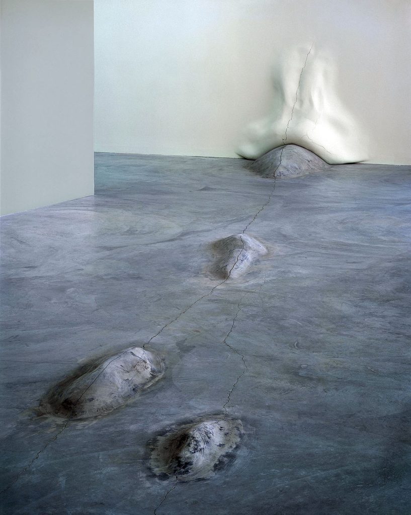
Jill Downen, The Posture of Place, (detail) 2004, Contemporary Art Museum St. Louis, concrete, polystyrene, gypsum, latex, 12 x 40 x 50 feet, Photo credit: Richard Sprengeler, Photo courtesy of the artist and Bruno David Gallery
DDL: I love the idea that “gray functions as a place of betweenness, a space for reflection.” It reminds me of how videographers set white balance with a ‘TV gray’ card before filming, and how that sets up all colors. Even something as simple as the brown ground that Rembrandt and Caravaggio used as a basis for their chiaroscuro techniques sets up the artist to see or imagine whatever they can envision.
In a previous conversation, you talked about how you move back and forth between abrading and rebuilding surfaces to get the result you want. You’ve also talked about the importance of temporality and fragmentation. We see this in everyday life, largely in architectural states of deterioration that are an integral part of your aesthetic. Can you elaborate more specifically about how and why temporality and fragmentation worked its way into your thinking?
Left: Jill Downen drawing in their Kansas City studio, 2024. Photo credit: Melissa Guadalupe Wolf. Right: Jill Downen, Cracked Air, 2024, plaster, powdered lapis lazuli, 10 x 8 x 2 inches. Photo by E.G. Schempf. Courtesy of the artist and Nunu Fine Art.
JD: I love your question. I’m aware that people pass through time and space in temporal bodies. I like to wonder, which will last longer, a brick or a baby? I also learned early on that destruction is part of creation, and the process leaves fragments in its wake. I collect broken chunks of material from the studio floor for future works. In the installation art, ideas about the symbiosis between the body and architecture are sculpted with parts or fragments of larger forms. The creative process demands an embrace of fragmentation and temporality. De-installation involves cutting and pulling elements out of walls and floors. Abrasions on fragmented parts then become raw material for newer works. I’ve never had a problem with that.
The body, with its collective sensing systems, is the primary vehicle one has for understanding the world. Even still, I struggle to see the whole – a meta-narrative that explains everything, given gaps and mysteries. The tension between parts and wholeness undergirds the artwork. Part of my role as an artist is to expose hidden energies and structures, heightening awareness for viewers and offering respite for our temporal bodies.
DDL: This goes back to what you spoke about a week or so ago about a “need to define empty space and silence.” After all, despite all the billions of perceivable galaxies, the universe is mostly cosmic voids. In closing, can you elaborate on the gravity of empty space and silence in your art?
JD: Silence is a daily necessity and, for me, it comes with empty space. How do you find balance within the cultural volume and onslaught of images we must navigate moment to moment? I need silence and a clear visual field. I try to quiet my mind by drawing so that I can listen. Making time for silence helps me listen to my body and ground myself about spiritual matters. Pockets full of air activate the drawings and architectural installations. My role is to affect space, not fill it. When preparing for the exhibition at Nunu Fine Art, I was in the drawing room, thinking about doing and undoing, doing and undoing repeatedly, until a surface appeared. I don’t want an illusion. I aim for a delicate balance between crafted edges, textures, and marks with plaster that creates a space of abstraction: one resistant to naming or representation. The artwork exists to open sensory experience to a weightless state for a population in need of silence.
Jill Downen, (dis)Mantle, 2010, The Luminary, St. Louis, plaster, polystyrene, latex, plumb line with plumb bob. Photo credit: Richard Sprengeler. Courtesy of the Artist and Bruno David Gallery.
Some final thoughts: It is important to note that few artists can offer pure enlightenment in their oeuvre like Jill Downen. Downen’s art gives us all the opportunity to feel something new and profound; something that touches our innermost awareness by capturing the essence of being through a quiet and clear aesthetic. Everything has a history in some form or another, and Downen brings that out in the open through fluid layers of love and respect for the materials they employ and the time it takes to make it all whole.
“I draw with plaster and concrete to shape space that is resistant to naming, representation, or constraint. The creative process involves ‘not knowing’ – a pathway that tells me I’m somewhere, but I’m unfamiliar with exactly where that is. I am in a state of being. The space holds a palpable presence. It feels like mist, a vast distance, breath, light resting in the air – weightless.”
Jill Downen